


Fanatics Live
Platform iOS & Web
Role: Sr. Product Designer ( End-to-End UX / Prototyping / Interaction Design / Usability Testing / Ideation)
Project Overview
When I joined Fanatics Live, I was tasked with leading the design and development of our initial feature set for their iOS app, which focused on sports memorabilia and card collectors. The challenge was to quickly get up to speed on this niche market, I had to design five important features within a tight deadline, and collaborate with teams spread across different time zones.
Problem
When Fanatics acquired Topps, we had a huge opportunity to lead the sports memorabilia and trading card market. But we were missing a key piece: a dedicated app for selling cards and supporting the growing card breaker community through live auctions. Without this, we couldn’t fully tap into the market’s potential or engage with our core audience of collectors and breakers.
immediate CHALLENGES
Rapid Market Learning: I had to quickly learn the world of card collecting and sports card breaking, a niche market that was unfamiliar to both me and the team, in order to create user-centered features.
Tight Deadlines: I was responsible for designing and delivering five critical features within just five weeks, all while ensuring high-quality execution despite the rapid pace.
Cross-Functional Collaboration: I had to worked closely with engineering teams that were across different time zones (Amsterdam, China), and maintain constant communication and alignment to keep the project on track.
User Testing without Tools: With no dedicated tools available, I had to get scrappy to gather user feedback through informal testing methods to validate and iterate on design decisions.
Building Structure from Scratch: There was no clear product vision or established design process, so I took the initiative to define both, creating a solid foundation that guided the team’s work.
Challenges
Since we lacked a clear vision for the product and its potential, I had to start my journey exploring how we could shape the app and think through the necessary steps for its development. This was a way for me to wrap my head around the possibilities and potential needs. I wanted a starting point to work from.

Research
To better understand the market, I dove into research on both card collectors and the card breaker community. I spent time analyzing competitor apps, like Whatnot, to see how they were successfully running live auctions and selling cards. I also gathered insights from our existing Fanatics customer base, focusing on what they valued most in their buying and trading experiences. I also started brainstorming ideas on what features the app could have aside from my initial requirements.
Research Insights
After gathering insights I broke down the data by Collector Wants, Seller Needs and Business Goals.
Collectors want
Quick access to rare cards and upcoming auctions.
Personalized content that reflects their preferences and favorite items.
Real-time updates on bids, auctions, and card availability.
A streamlined search experience to easily find specific cards or sellers.
Sellers need
A simple and intuitive interface to manage and view live auctions while breaking.
Real-time feedback on viewers and active participants during auctions.
A place for Collectors/Buyers to view their Live & Upcoming shows with details
Quick access to tools for managing their auctions and connecting with buyers.
Business requirements
A simple and intuitive interface to manage and join live auctions.
Real-time feedback on viewers and active participants during auctions.
Fast, easy navigation to move between auction setup, bids, and live streams.
Quick access to tools for managing their auctions and connecting with buyers.
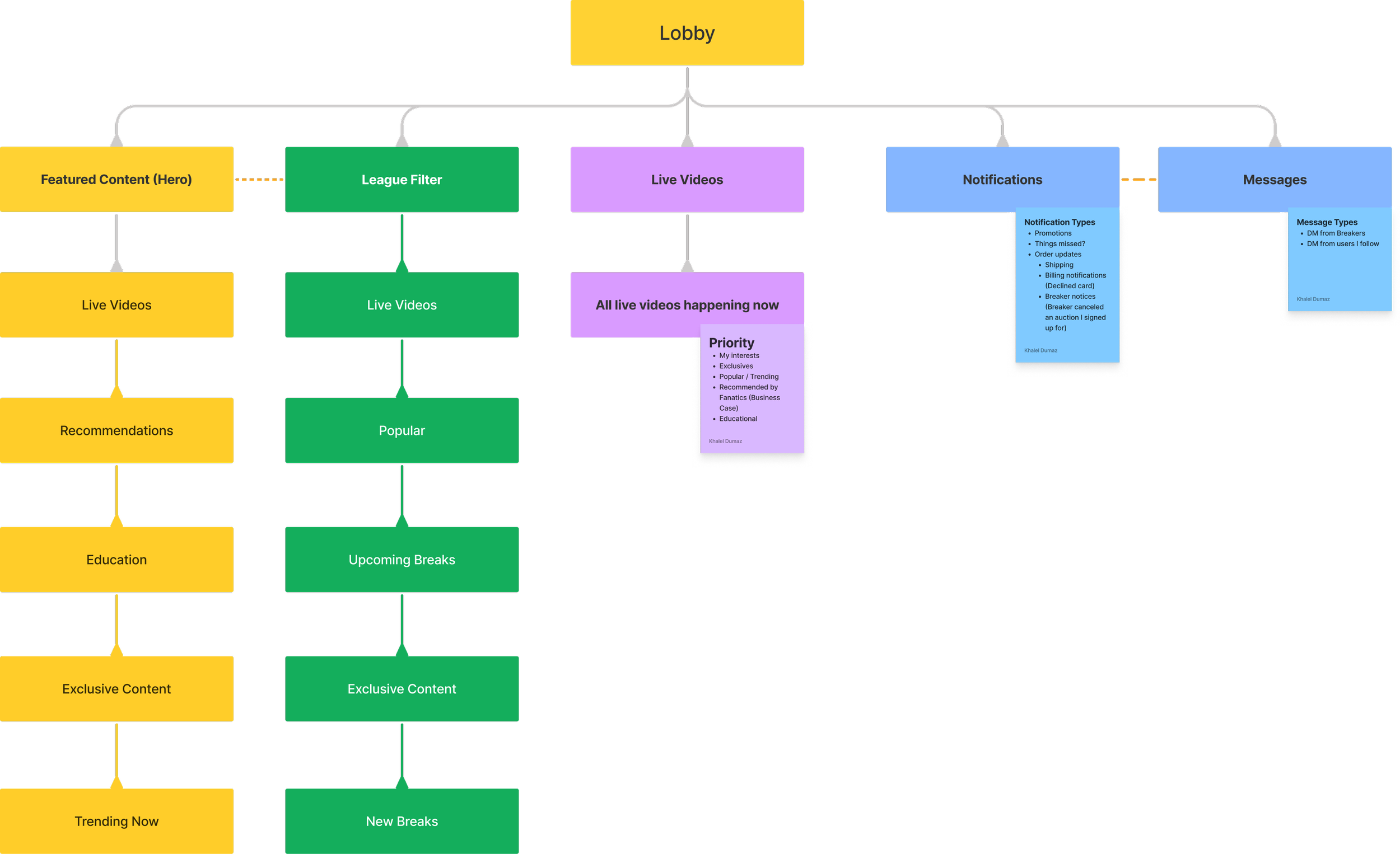
Design Solutions & Explorations
After identifying all the needs and wants of customers, sellers and the business I started designing solutions. Utilizing familiar patterns and styles I sought to ensure the user could easily navigate first and foremost. They needed to find what they were looking for immediately so I prioritized top filters.
UX/UI Considerations:
Navigation
Filter
By Show
By Topics (Bonus Idea)
By collector preference
After exploring Navigation I moved on to the next important aspect of the UX, our Event/Show cards. This was tricky because the cards needed quite a bit of information but it couldn’t be overwhelming or too small. Structuring the layout of these show cards needed to be clean and intuitive.
UX/UI Considerations:
Event / Show Cards
Hero Show Card
2x2 Grid Show Cards
Meta Data
Show status
Seller Name & Logo
Sport
Break Type
Show Time
Product Type
After the initial explorations I continued to refine and consider new ideas and patterns.

Bonus Idea
Live Topics: One idea that I found intriguing is the possibility of introducing a topics feature that enables buyers to engage in discussions about leagues, players, and other subjects of interest to them. The concept wasn't initially planned, but since our auction feature already included a live chat experience, I thought we could make use of that and develop a topics forum using the same functionality. We just needed to design the front end user experience.
DISAGREE & COMMIT
Although the Topics concept was originally beyond the initial scope I had a strong belief that we needed something to keep buyers in our app before and after a purchase. There was significant interest in the idea from both the development and product teams. In response, I put on my PM hat and created a PRFAQ to explore how we could viably implement it with minimal effort.
After reviewing the PRFAQ with our engineering group we decided to keep it in our back pocket and focus on the initial features necessary for launch. Which was the right move.


OUTCOME
After addressing user feedback and improving the design, I prioritized a more intuitive navigation experience and optimized the metadata size. Once the full prototype of the experience was ready, we conducted an A/B test with 67 collectors who had signed for our pre-launch waitlist.

App success
Conversion rates from the show feed to Live shows was 86.4%. (The caveat in this statistic was that fans had a high intent when they found shows and cards they were interested in.)
$30m in GMV in the first 4 months of the app being live
5 Star app rating
Consistent user growth week over week.


Amazon / Neighbors / Ring
Platform iOS, Android & Web
Lead Product Designer \ Product Design Manager ( End-to-End UX / Visual Design / Prototyping / UI Design / Usability Testing / People Management)
Neighbors was a new concept by Ring that sought to connect and provide real-time hyper local safety related information from local news, public safety agencies and Neighborhood communities. Tapping into Ring’s large Video Doorbell consumer base was an ideal starting point for the project.
The Problem
Homeowners lacked a digital platform to share and receive real-time safety information and connect with neighbors, law enforcement, or public safety agencies. Our goal was to create a seamless user experience that delivered timely safety updates, integrated Ring video features, and connected homeowners to their communities.
understanding our customers
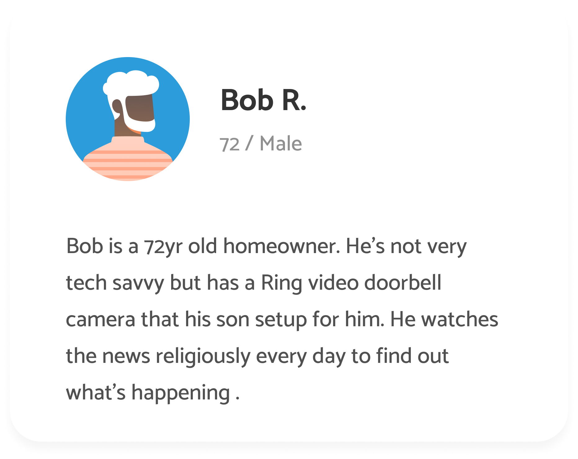
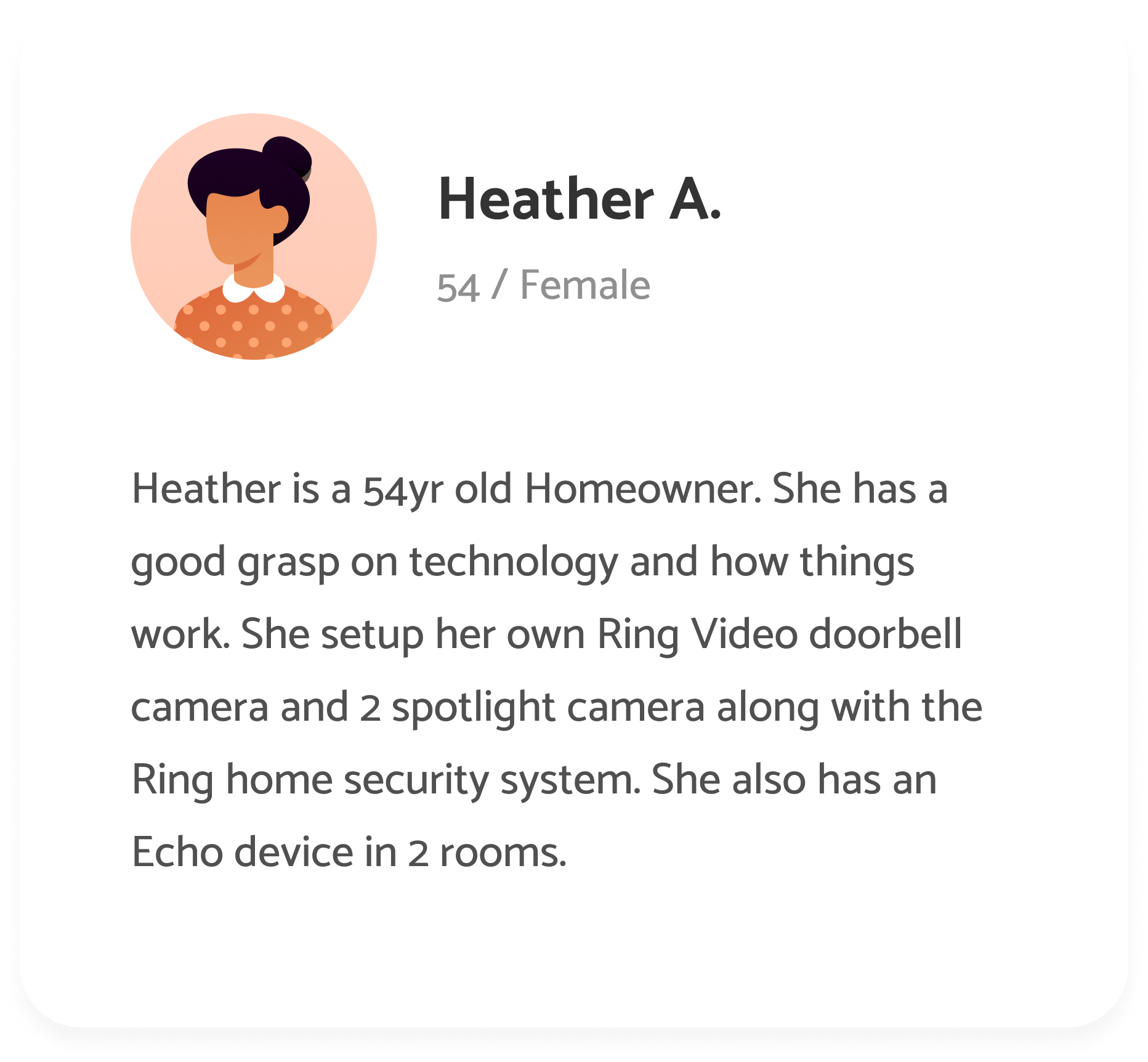
Through research, I identified our target audience—primarily older homeowners focused on property security. They relied on local news but had minimal experience with social media apps like Nextdoor. This insight guided our approach to make the app intuitive, accessible, and easy to use for this demographic.
Stakeholder Alignment
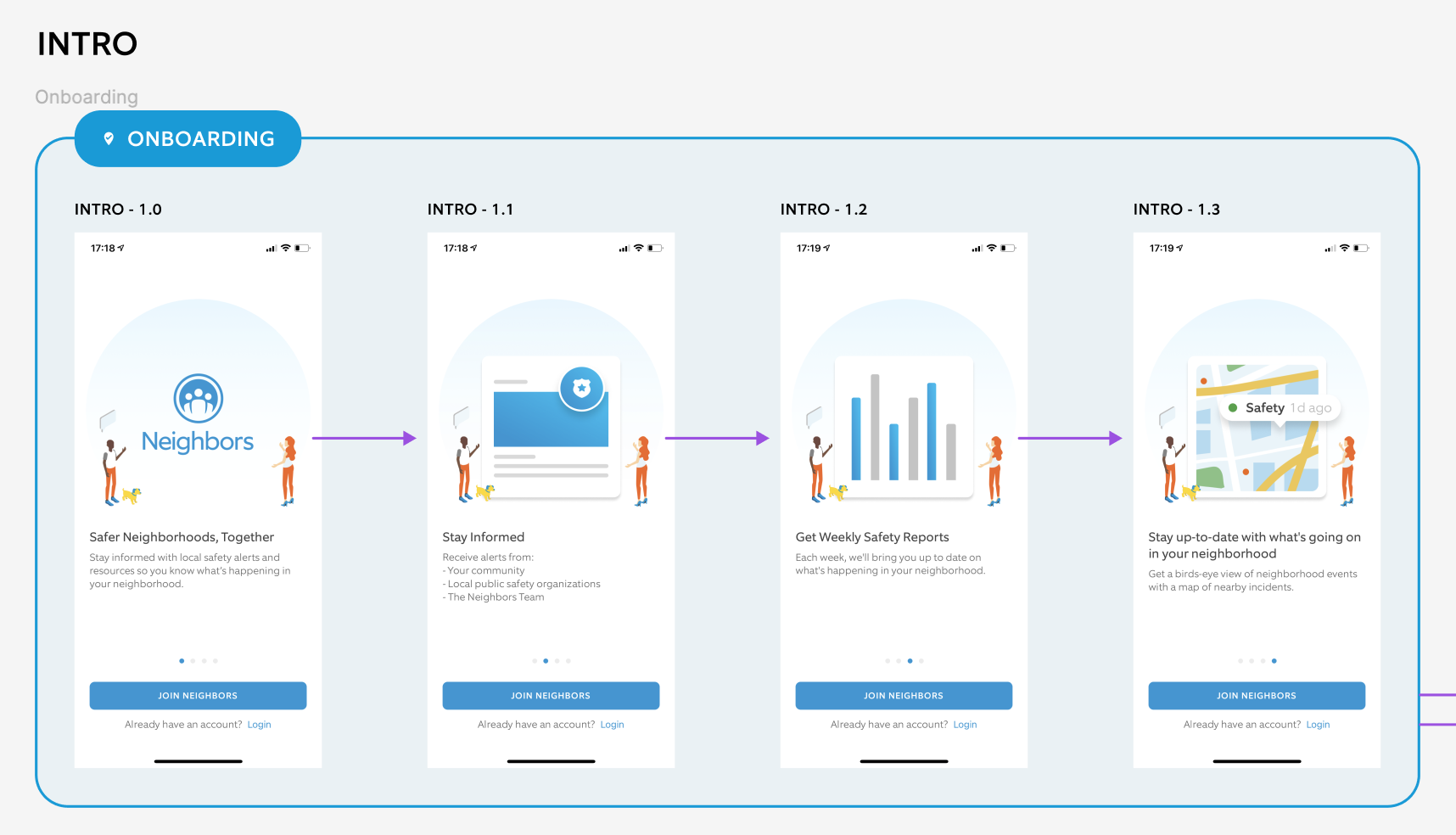
To kick things off I utilized some existing illustrations to wireframe a benefits-focused onboarding design to secure alignment with our stakeholders on the vision before anything else. Priority was placed on delivering quickly, while ensuring everyone was in agreement on the concept and value proposition.
Rapid Value Prop eXPLORATION
Benefits based onboarding
Key points that came from initial research
Bonus idea derived out of customer insights

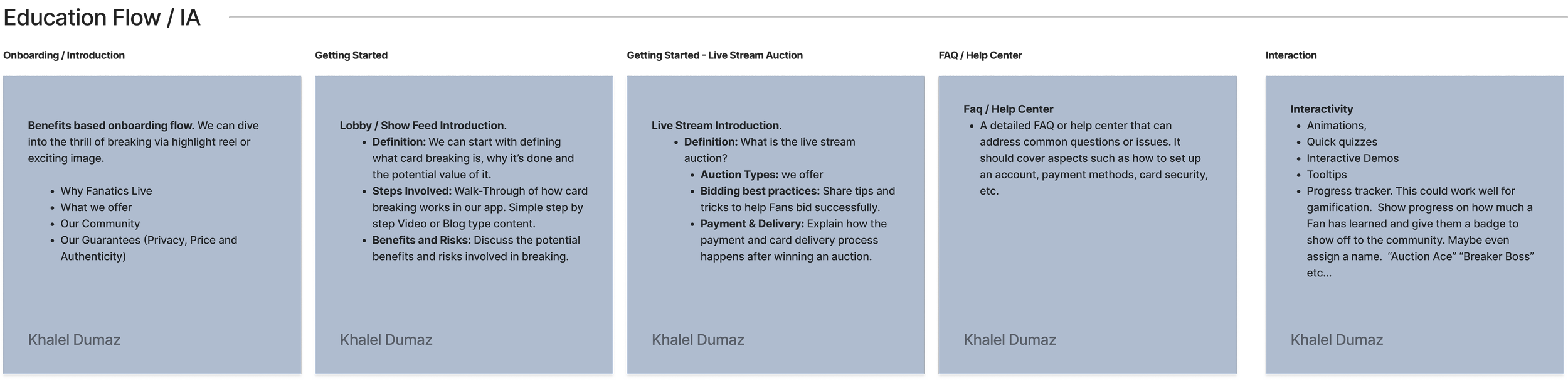
basic ia
I developed a basic information architecture (IA) to give stakeholders a clear vision of what the app could become and to align on the primary features that would deliver the most value at launch.

The Navigation Dilemma
The main feature and primary view of the app was the newsfeed, but we also needed to provide easy access to other sections of the app for users to view more detailed safety information. There was an unwillingness by dev to implement a bottom navigation bar, which was my initial proposal, so I had to adapt and come up with an alternative that was easier to develop yet straightforward for users to navigate.

Design Validation with Qualitative Testing
After conducting Preference Test & Five-Second Test comparing the icon tiles to the illustration tiles, I found that users often gravitated towards the more visually appealing illustrative designs, as they were perceived to be significantly more engaging and rich in terms of visual storytelling and user interaction.
newsfeed, COMMENTING AND map EXPLORATION
When designing the content cards, I considered user's behavior when consuming news and how that could be applied to the neighbor's feed. I adopted a familiar pattern the newsfeed cards and commenting to accommodate the needs of all users, regardless of technical proficiency.

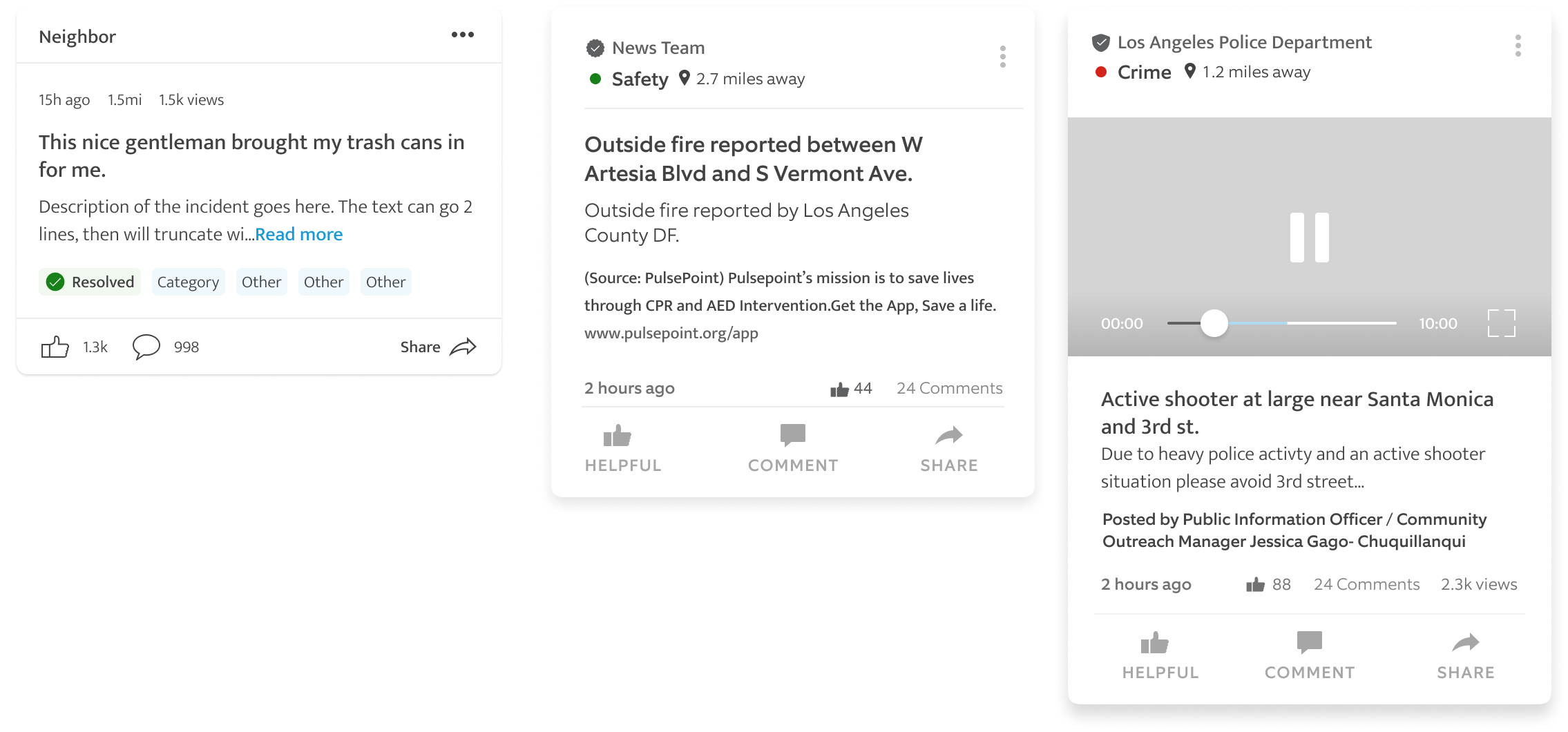
design output
Navigation: Adapted the design to avoid a bottom navigation bar, opting for a top slider that aligned with our development constraints while keeping the interface intuitive.
Content Cards: Used familiar social media patterns to accommodate users’ varied technical proficiencies, making it easy for all users to engage with content.
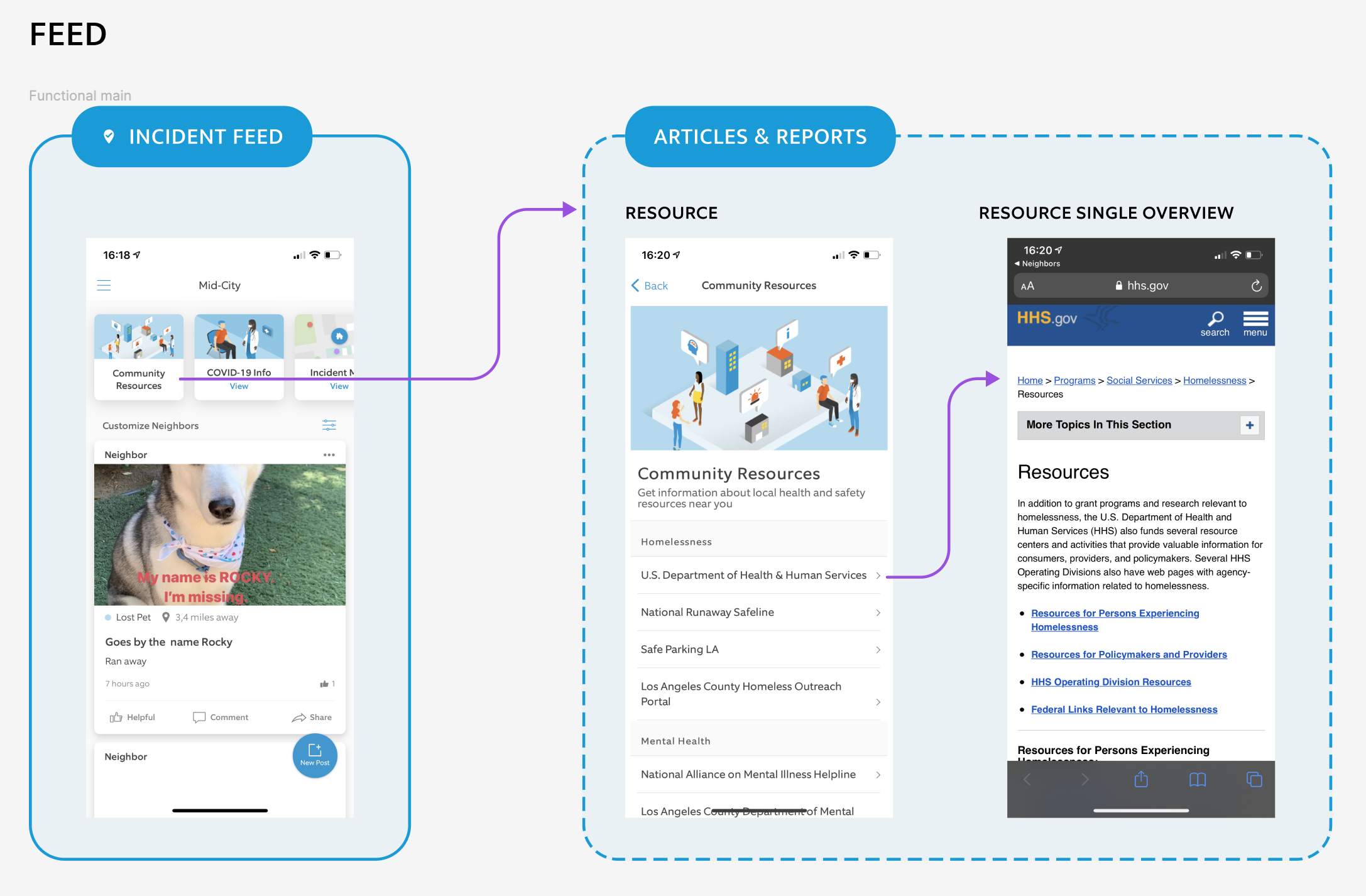
Map View: Designed a map view to give users a quick way to see everything happening nearby at a glance without the need to scroll the newsfeed.
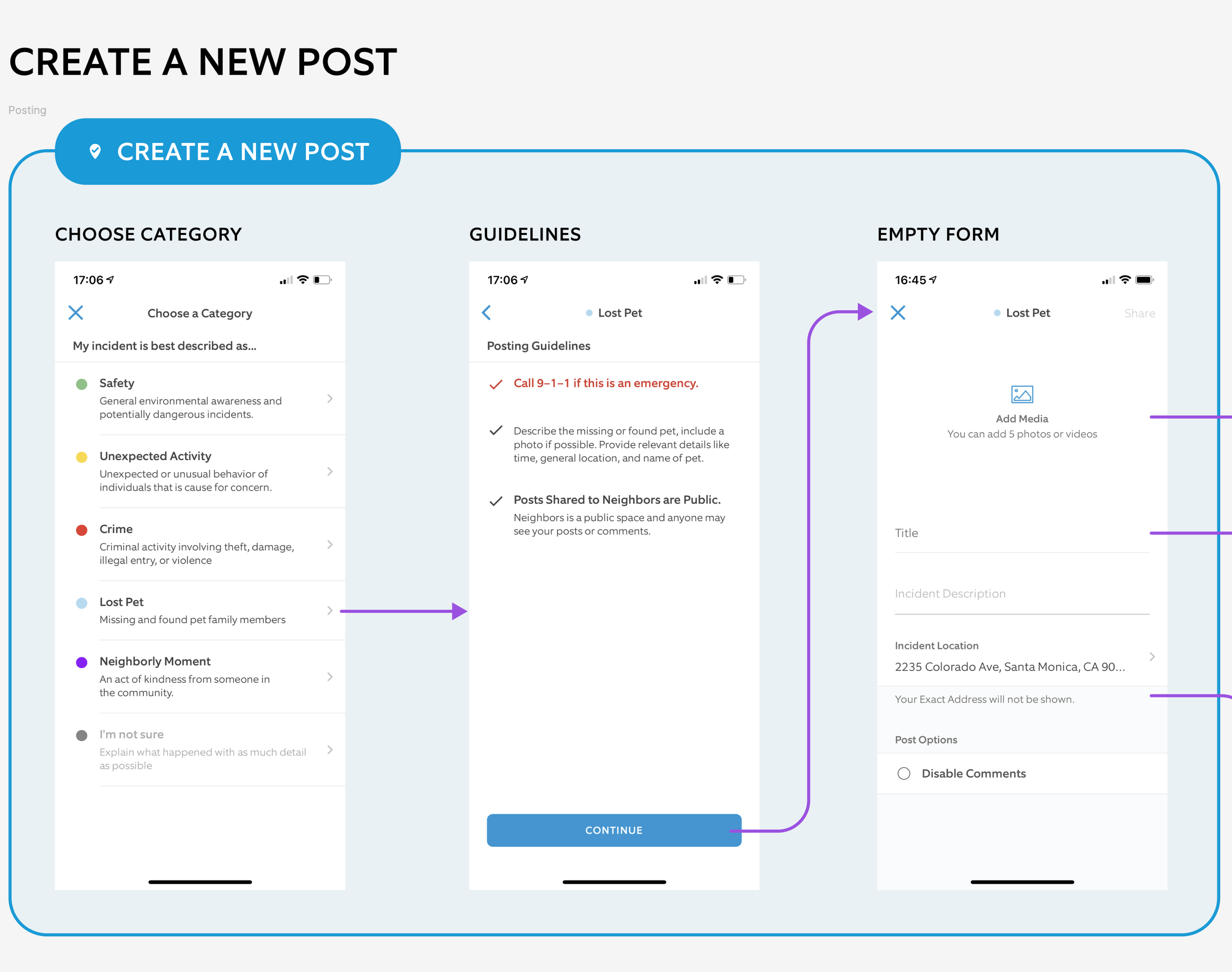
Posting Guidelines
Having determined the content card layout and what the newsfeed would look like, I collaborated with our Trust & Safety team to create posting guidelines. To ensure compliance with the unique guidelines for each category, I presented the designs to our legal team before conducting user testing.

design output
Newsfeed: Featuring real-time safety updates and easy access to Ring video clips.
Trust & Safety: Worked closely with the Trust & Safety team to establish posting guidelines, ensuring compliance with legal standards.
Validating Design Solutions
After developing a full prototype of the primary experience I tested it with Ring users via User Testing.com. Users struggled with locating incident categories and the distance from their home. I made improvements to the UI to help users more easily determine the proximity of incidents to their home or current location.
Outcome
The Neighbors app quickly gained popularity, amassing over 20 million monthly active users. It established partnerships with public safety agencies and received a 5-star rating with over 262,000 reviews. The app became a go-to platform for homeowners to stay informed and connected within their communities. Initially a standalone app it was so successful we incorporated into the primary Ring device management app.

Loot Crate iOS App
Platform iOS
Lead Product Designer / Product Manager (End-to-End Design / Roadmap Development / Feature Prioritization & Backlog Management / Usability Testing)
The Loot Crate app was a concept I championed to the CEO of Loot Crate. My vision was to build an app that allowed our core audience of geeks and gamers to congregate and connect with each other inside our own Loot Crate ecosystem. Through that connection we would be able to drive sales of our products and create engaging content for our looters.
The Problem
Geeks & Gamers, also known as "Looters," were passionate about expressing their fandom but lacked a platform to connect with other like-minded individuals. The only mainstream option available to them was Facebook groups. By creating an experience within our own ecosystem, we aimed to empower them to fully express and share their fandom with a community of people who share similar interests while simultaneously providing a unique mobile experience that would drive more sales at a higher conversion rate.
Challenges
Organizing our product offering during a rebranding process
Clearly defining the value proposition for each type of crate in our product catalog
Structuring our content to avoid confusion and information overload
Integrating key web features
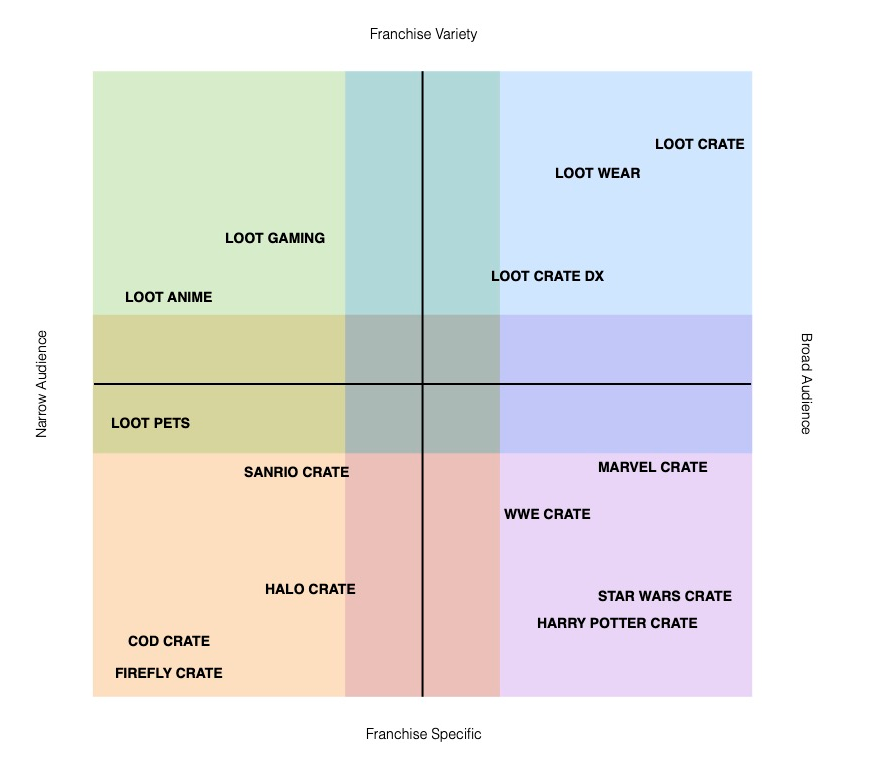
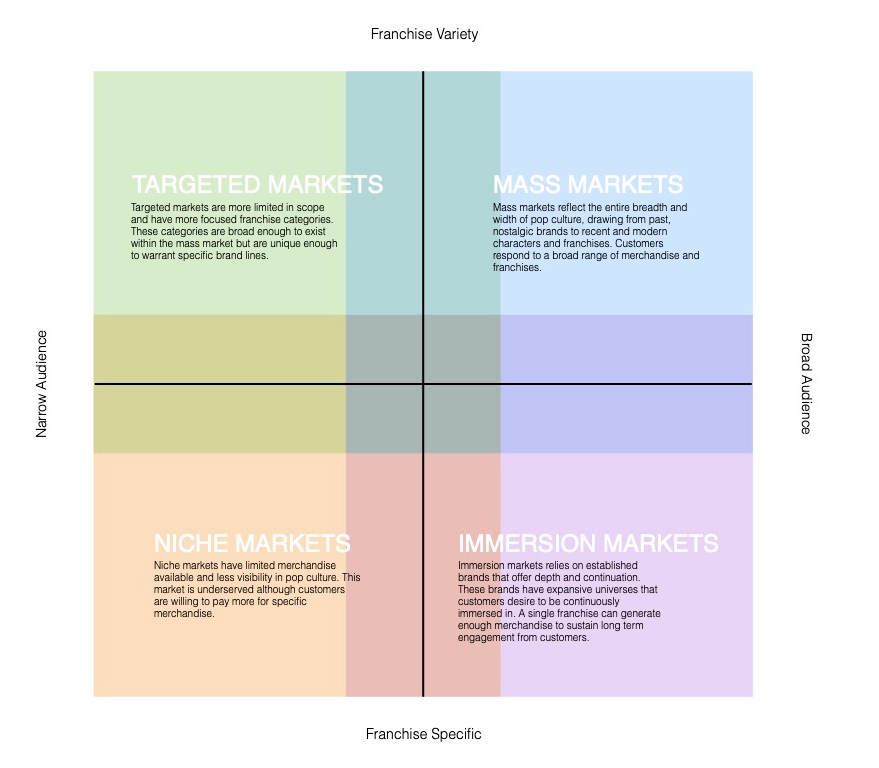
Value Prop & Product Discovery
One of the initial challenges was to properly classify our product offerings and identify our target audience. This process helped me devise a strategy for creating a digital catalog of our crate offerings, organized by type of fandom.
Initial implementation was one Loot Crate box with multiple products and collectibles from different brands.
The Journey
By engaging with customers about our current website, I gained insight into the typical journey of our "Looters" and identified pain points and key aspects of their experience. This was crucial in understanding how they navigate the app experience and determining what elements could be transferred from the web to mobile and what needed to be removed to streamline the purchasing process.
I broke down their journey by:
Flow of information
User Goals
Pain Points
Opportunities
Storytelling and Hooks
To understand how users would perceive our product offerings, I evaluated key moments in their journey such as:
Triggers - What made them come to our app?
Actions - What’s the next action we want them to take?
Reward - What is their reward for taking this action?
Investment - How deep is their investment in this journey?
Structure
After conducting a thorough analysis of our user journey, navigation, product offerings, and user personas, I began to develop ideas for structuring the content. I utilized Lo-Fi designs to explore these ideas, allowing me to focus on information hierarchy and content consumption without getting too caught up in the design details. My initial priority was to prioritize and implement our core MVP features.
Buying Experience
Topics / Content Feed
Commenting
Selecting Topics
Design Deliverable
After testing low fidelity designs with our "Looters" and incorporating their feedback, as well as simplifying the feature set due to development constraints, we arrived at a streamlined design layout with minimal text, which performed exceptionally well in testing. Despite the positive results of the lo-fi testing, I wanted to conduct further testing with a high fidelity version, incorporating our brand colors to provide a complete experience for our testers.

PROJECT RESULT
During the first month of launch, the Loot Crate mobile app quickly became the preferred platform for our iOS users. We saw a significant decline in daily active web users as they migrated to the app, resulting in a 12.3% conversion rate from storefront to checkout and 500,000 monthly active users within the first 27 days. Due to its success, we began development of an Android version.
Summary
Situation: Geeks & Gamers, or "Looters," lacked a platform to connect with like-minded individuals and express their fandom, with Facebook groups being their only mainstream option.
Task: Create an experience within our ecosystem to empower users to share their interests and fully express their fandom, while addressing challenges like rebranding, defining value propositions, structuring content, and integrating web features.
Actions:
Classified product offerings and identified the target audience to create a digital catalog of crate offerings.
Engaged with customers to understand their journey, pain points, and app navigation, and determined which elements to transfer from web to mobile.
Evaluated key moments in users' journey (triggers, actions, rewards, and investment) to understand their perception of product offerings.
Conducted a thorough analysis of user journey, navigation, product offerings, and user personas, and developed ideas for content structure using Lo-Fi designs.
Prioritized and implemented core MVP features, including buying experience, content feed, commenting, and selecting topics.
Tested low fidelity designs with users, incorporated feedback, and simplified the feature set due to development constraints.
Result: The Loot Crate mobile app became the preferred platform for iOS users, with a 12.3% conversion rate from storefront to checkout and 500,000 monthly active users within the first 27 days. The success led to the development of an Android version.

Content Management system
During the development phase, I worked closely with our Scrum Master, Harold, to find a dependable CMS to integrate into the app. After conducting thorough research, we identified Contentful as a promising option and presented it to the Head of Product, Moonie. Subsequently, we collaborated with the Contentful team to incorporate the required APIs for retrieving essential content.
SOCIAL MODERATION

SPORTS CRATE
Information architecture and v1 wireframes


