Case Studies
Case Studies & UX Artifacts
Deep dive into the design process, challenges, and solutions behind key projects.
All Case Studies
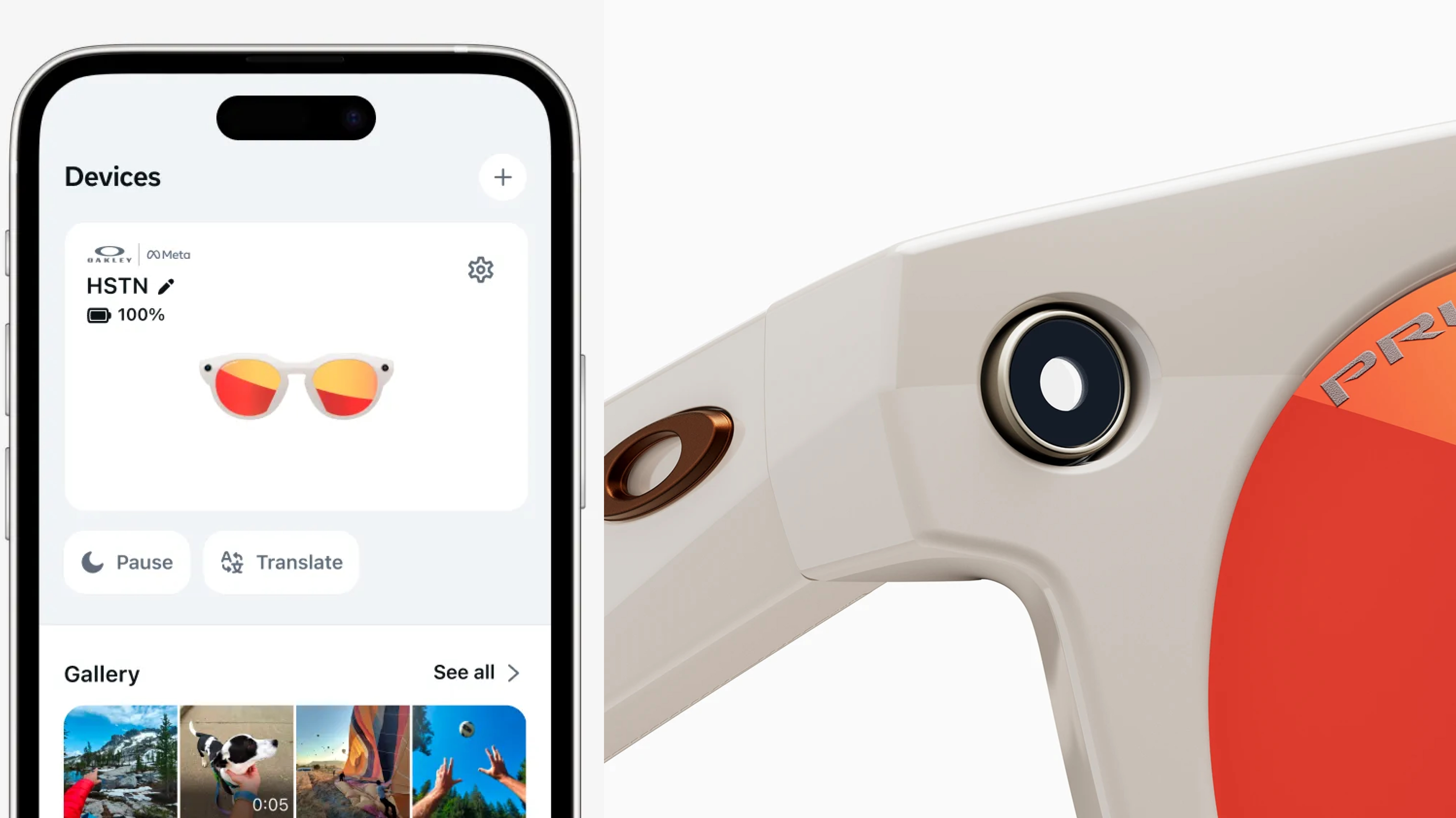
2025-Present • AI Wearables, Meta AI App
Media AI Experiences
Capture Studio is an AI-powered post-capture system that transforms raw, passive captures from smart glasses into share-worthy moments. The system analyzes all captured media, selects the most meaningful moments, enhances quality automatically, and presents a clean, confidence-driven feed.
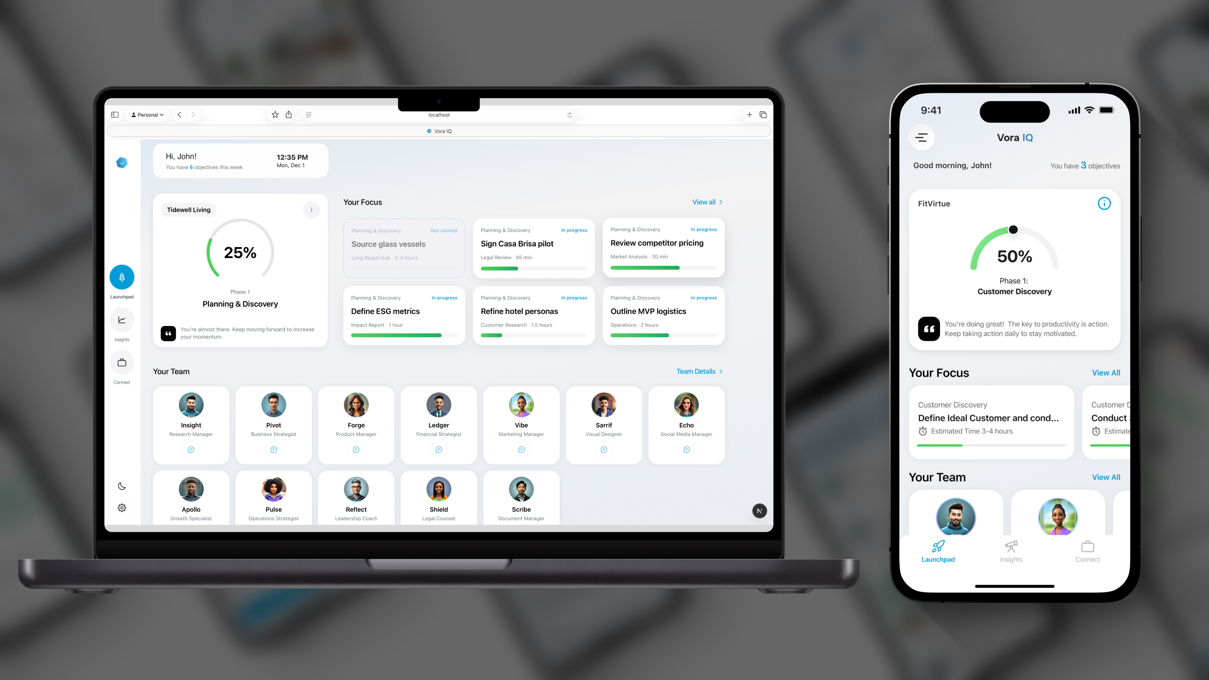
2024–Present • iOS, Web
Vora IQ
AI Operating System for Founders. Designing clarity, momentum, and execution for people starting from zero.
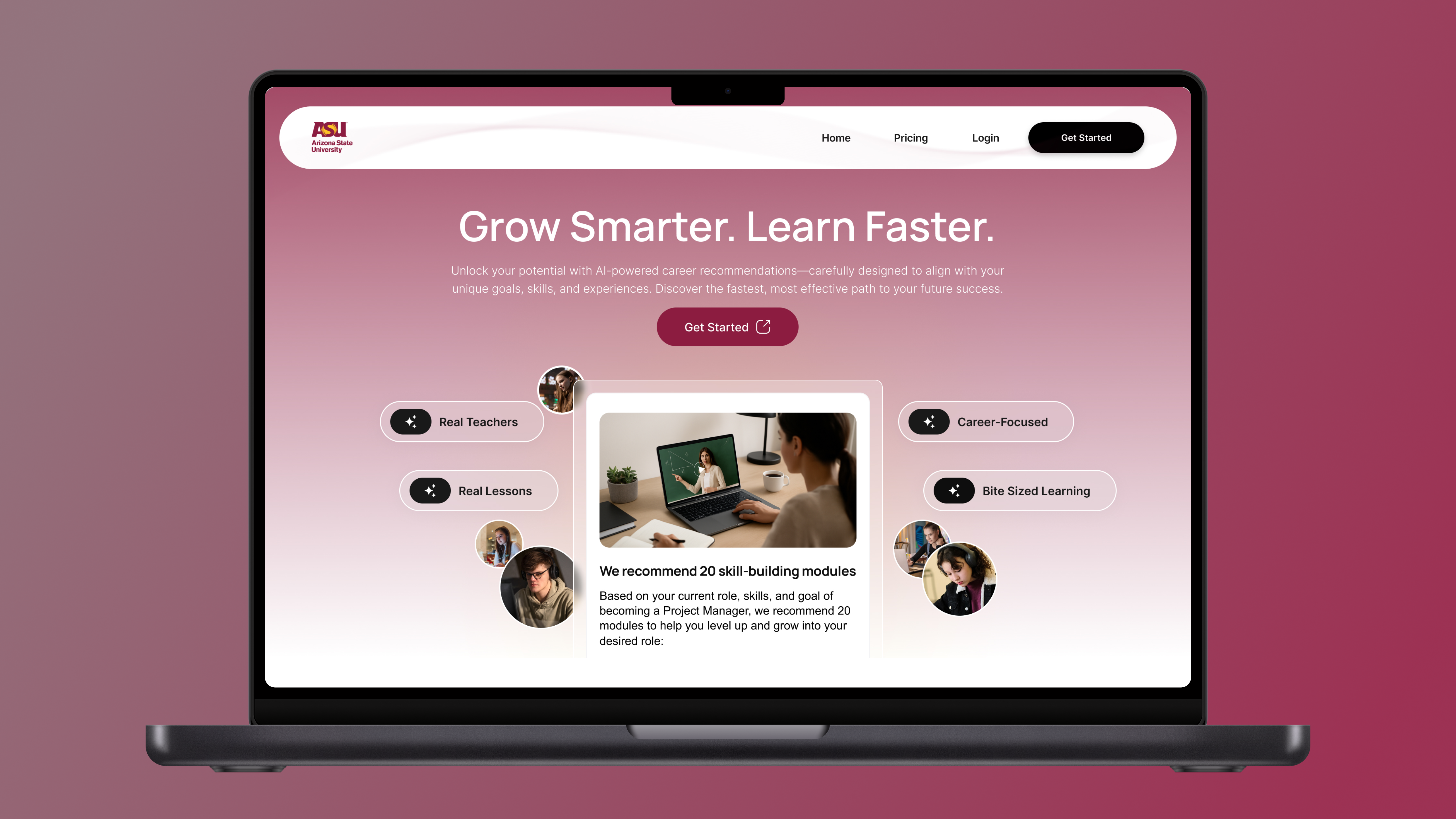
2025 • Web, Mobile
Arizona State University
AI-Powered Personalized, Modular Learning Pathways. Designing trust, relevance, and clarity in AI-driven education.
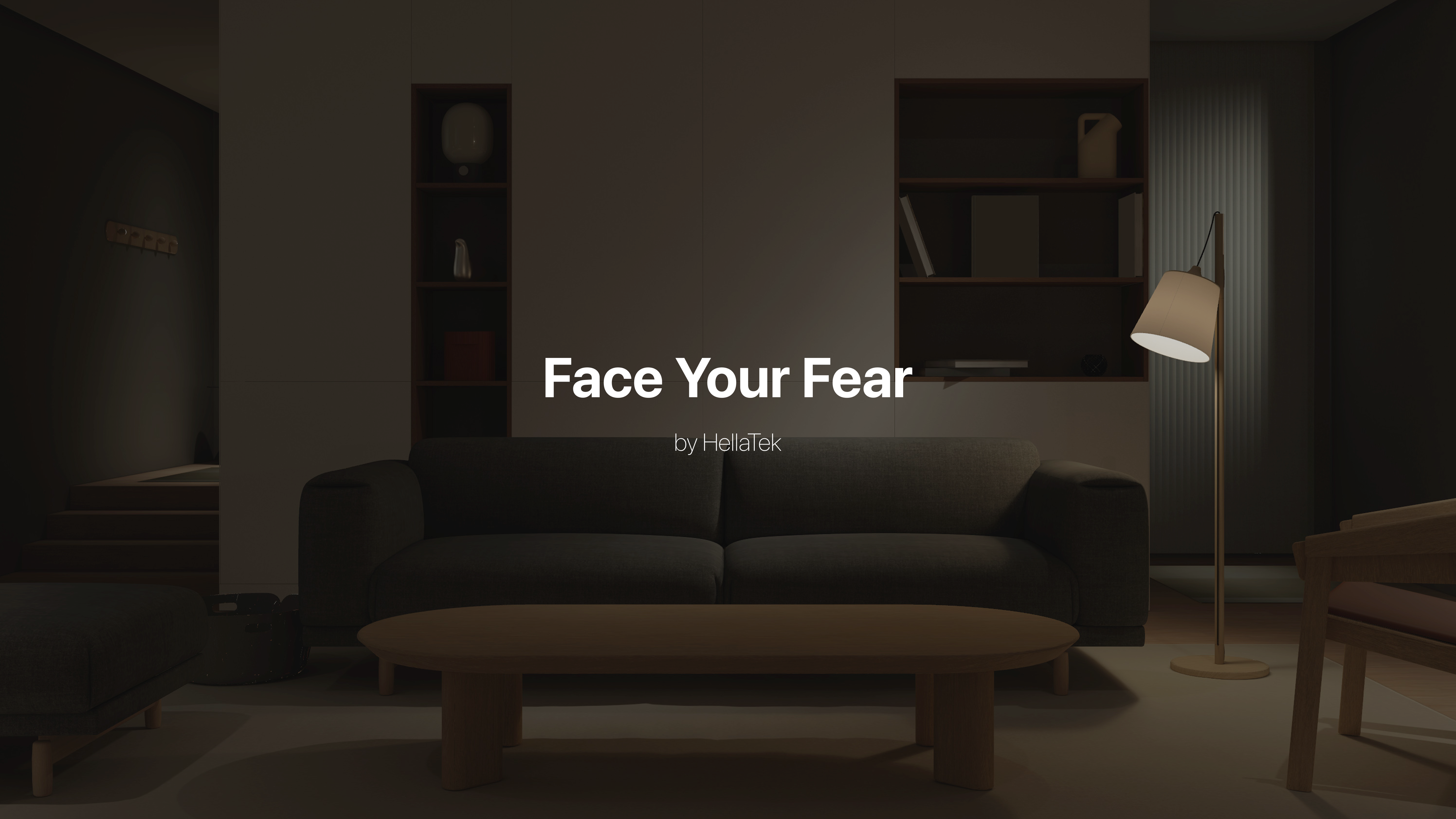
2024 • VisionOS
Face Your Fears
Immersive Exposure Through Play, Not Therapy. Designing calm, controlled XR experiences for fear regulation.
2023–2024 • iOS, Web
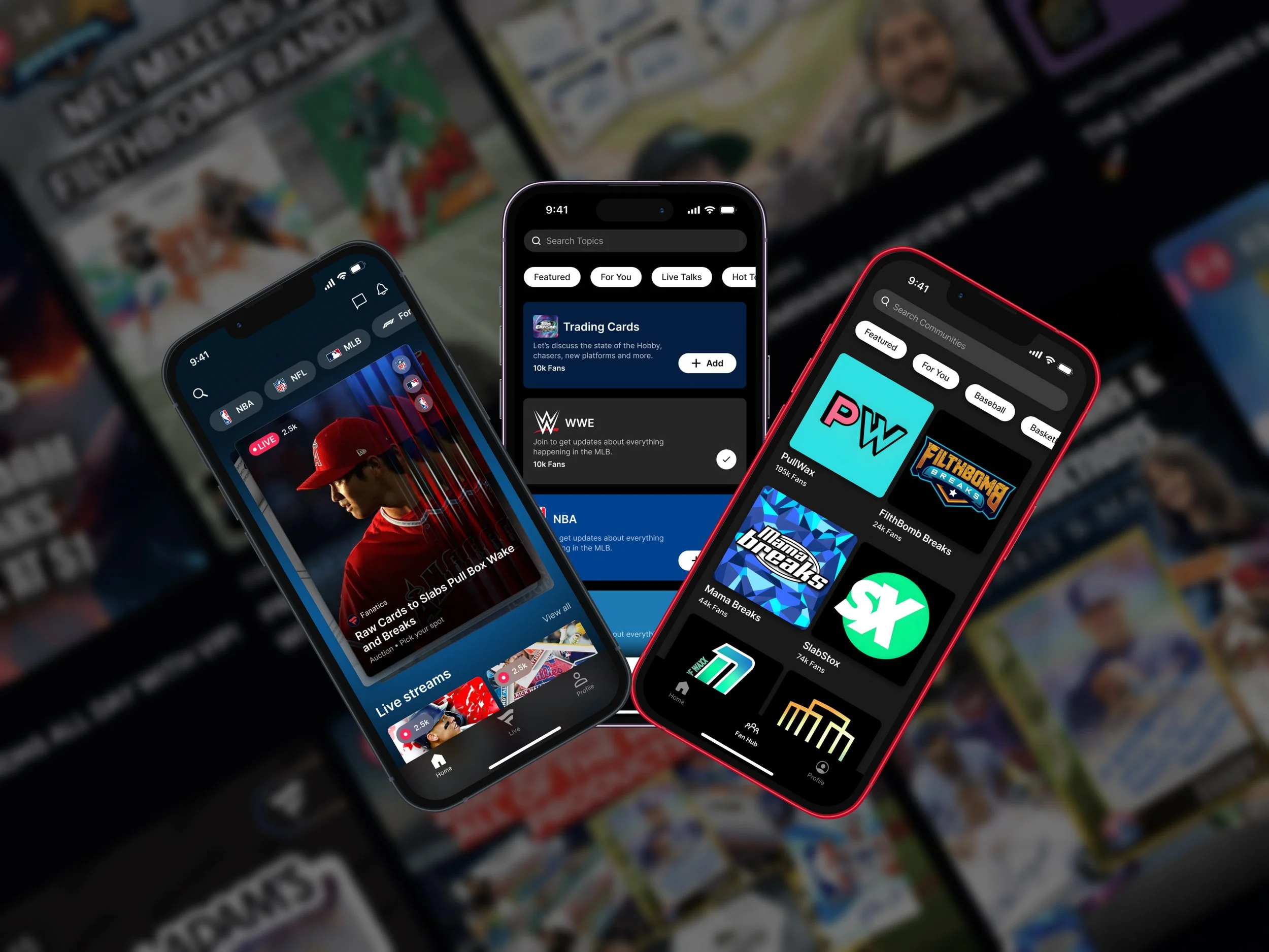
Fanatics Live
Live Commerce for Collectors and Card Breakers. Designing clarity, speed, and trust in real-time sports collectibles.
2018-2023 • iOS
Ring Neighbors App
Hyperlocal Safety Through Community and Trust. Designing accessible, real-time safety experiences for homeowners.
2015-2018 • iOS, Android
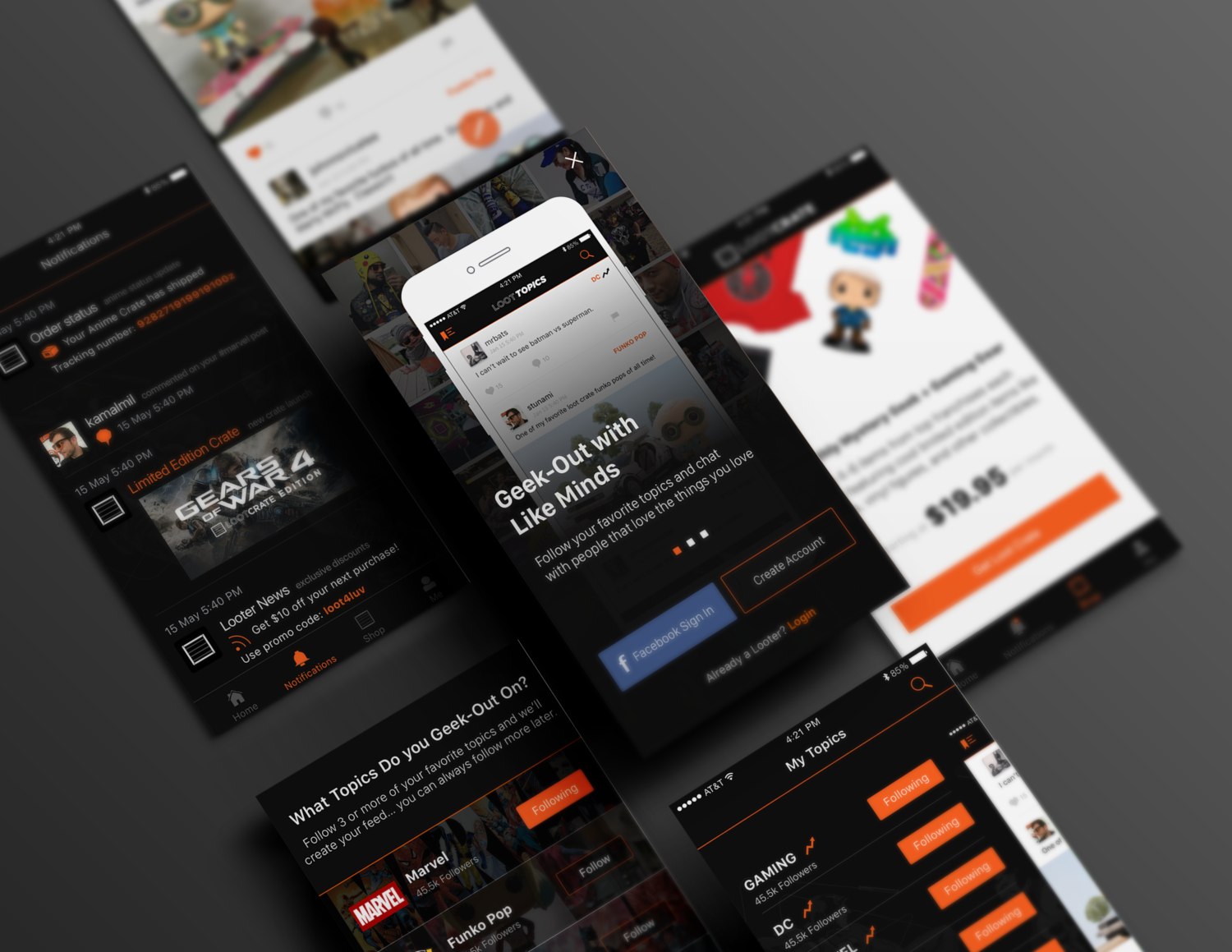
Loot Crate
Designing a community-driven commerce experience for geeks and gamers.